
Everyday India — a research based illustrated documentation of multiplicity and multiculturalism in the Indian graphic art/ design landscape.
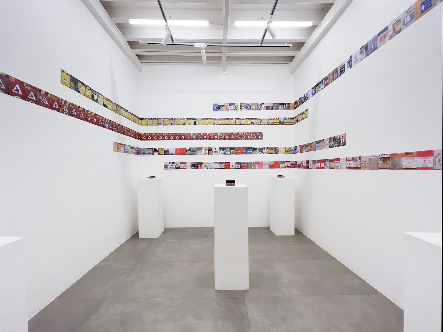
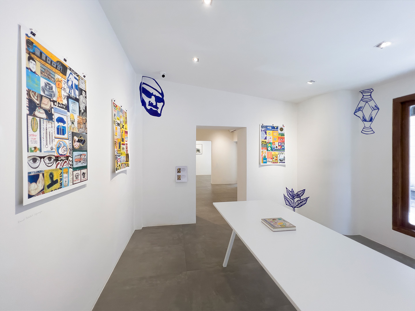
A month-long exhibition at 47-A, a design gallery in picturesque Khotachiwadi, Mumbai — Everyday India is a collection of observations, both panoptic and meticulous, that looks at design beyond the confines of ‘file dimensions’. The spillage of ‘graphic design’ onto the streets — a place where the formal and informal meets. It is also an enquiry into where design ends and art begins and vice versa and the overlaps between the two.

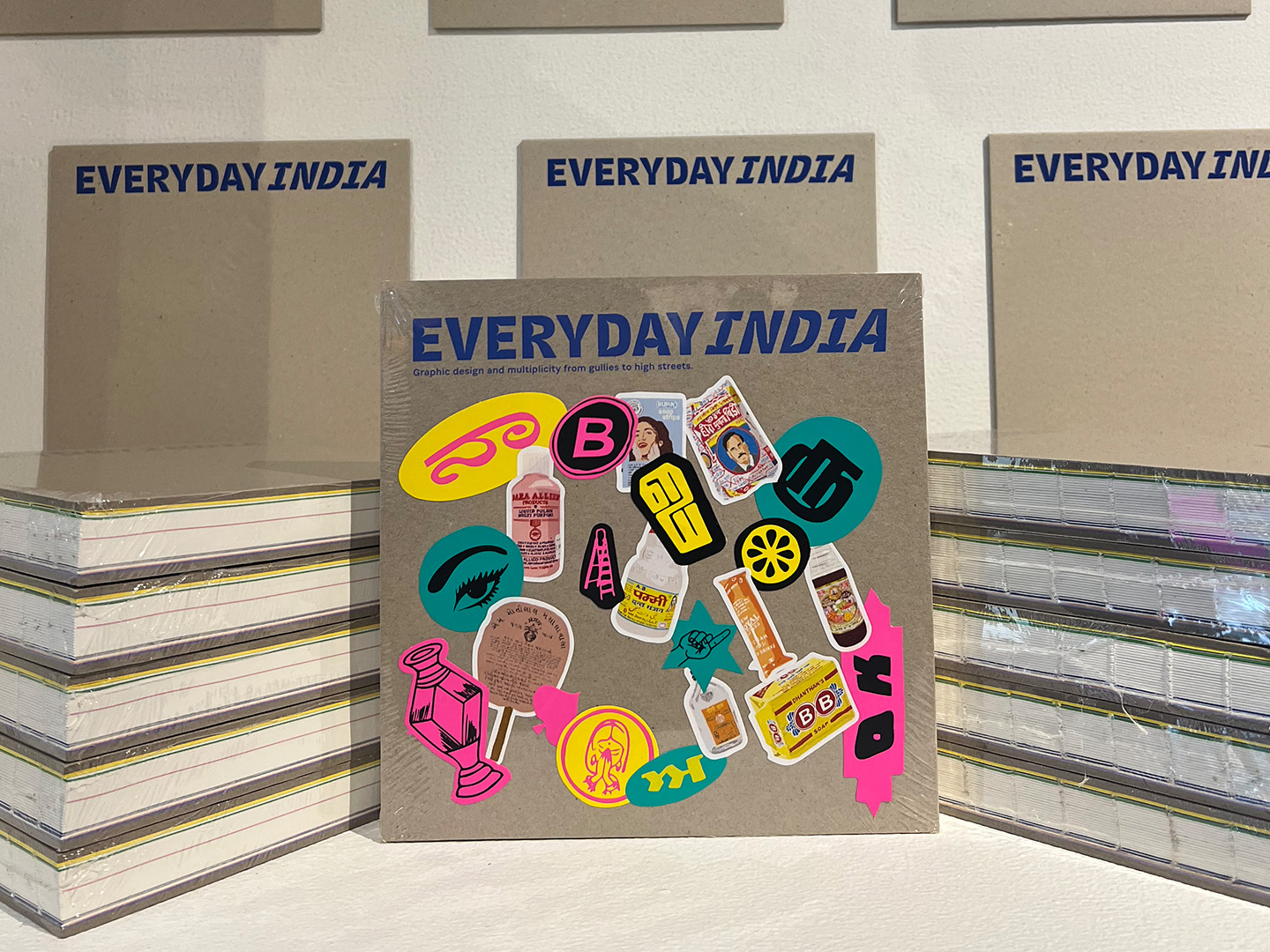
Everyday India (2023) lives on in the form of a book that serves as a record of the rigorous documentation in the process of putting together exhibits.
The show is divided into four series — Storefronts & Signages, Brand Guides, Illustrated Specimens and Oh Flip. Each series observes the graphic landscape in India with a different lens.


Series 1:
Storefronts & Signages
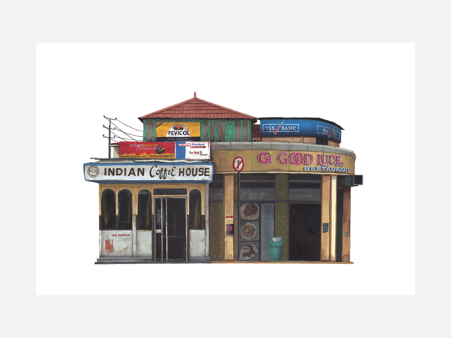
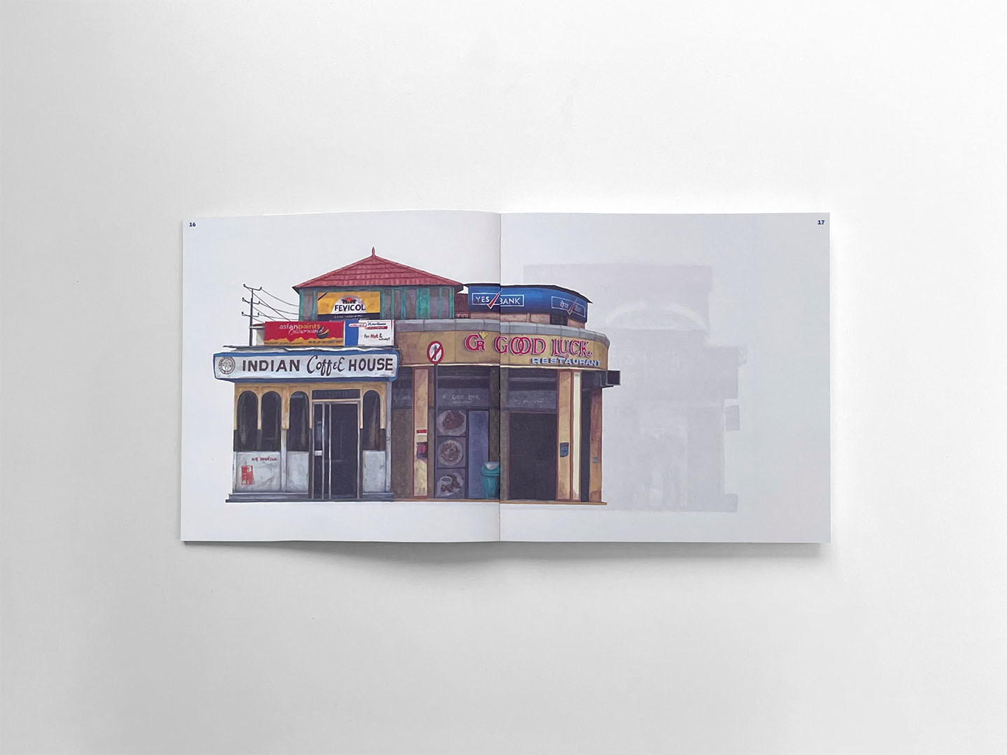
A series of 6 hand painted illustrations of imagined street side scenes using real existing signages. Each depicts the interplay of independently designed elements that exist within the urban graphic landscape and how they come together and form a new layered multicultural and multilingual collage.
Medium : Acrylic paint on Canson archival paper.



Series 2:
Brand Guides
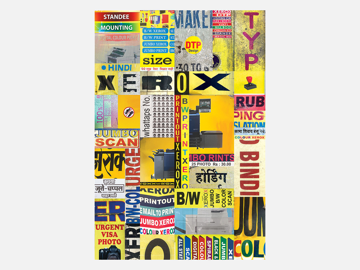
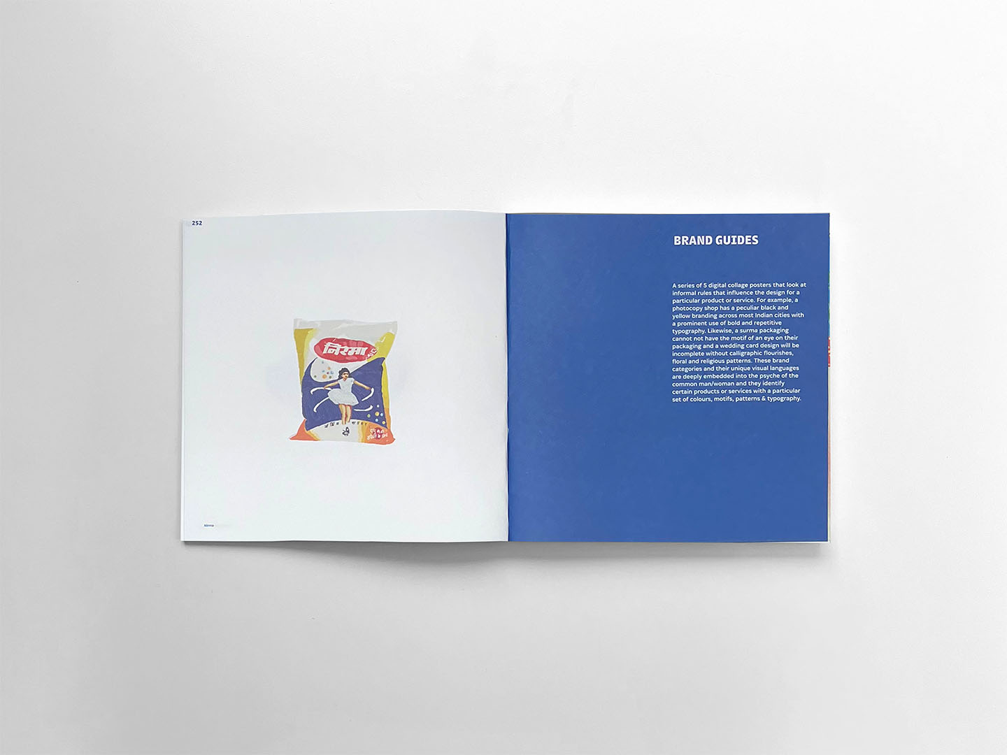
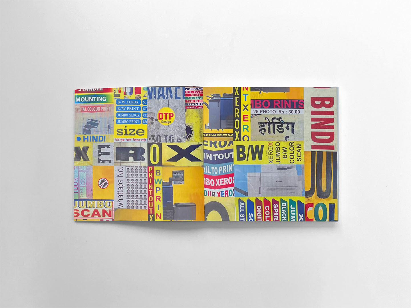
A series of 5 digital collage posters that look at informal rules that influence the design for a particular product or service. For example, a photocopy shop has a peculiar black and yellow branding across most Indian cities with a prominent use of bold and repetitive typography.
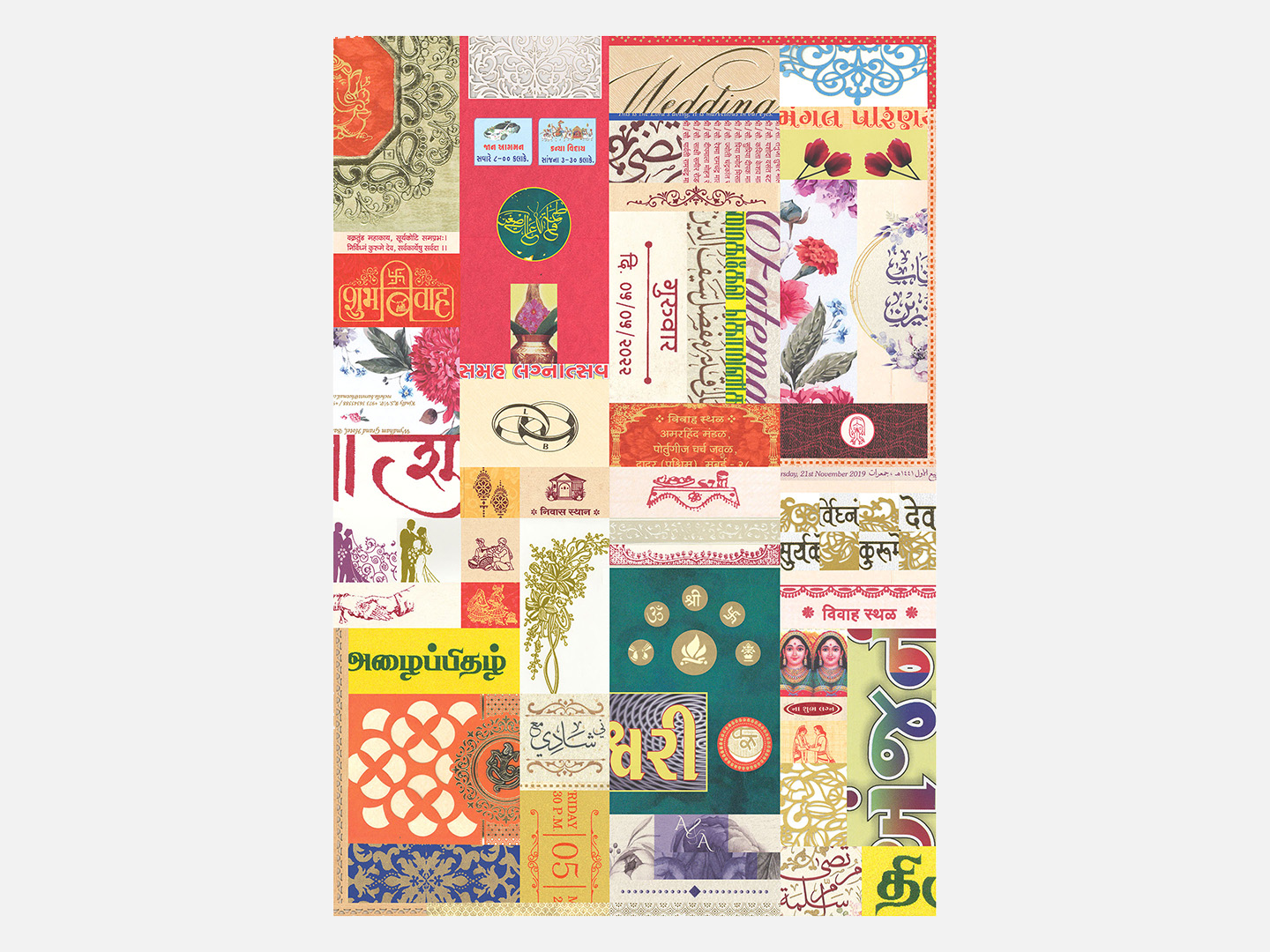
Likewise, a Surma packaging cannot not have the motif of an eye on their packaging and a wedding card design will be incomplete without calligraphic flourishes, floral and religious patterns. These brand categories and their unique visual languages are deeply embedded into the psyche of the common man/woman and they identify certain products or services with a particular set of colours, motifs, patterns and typography.
Medium: Original work is a digital collage. Inkjet print on archival Hahnemuhle paper.
Size: A1 and A2



Series 3:
Illustrated Specimens
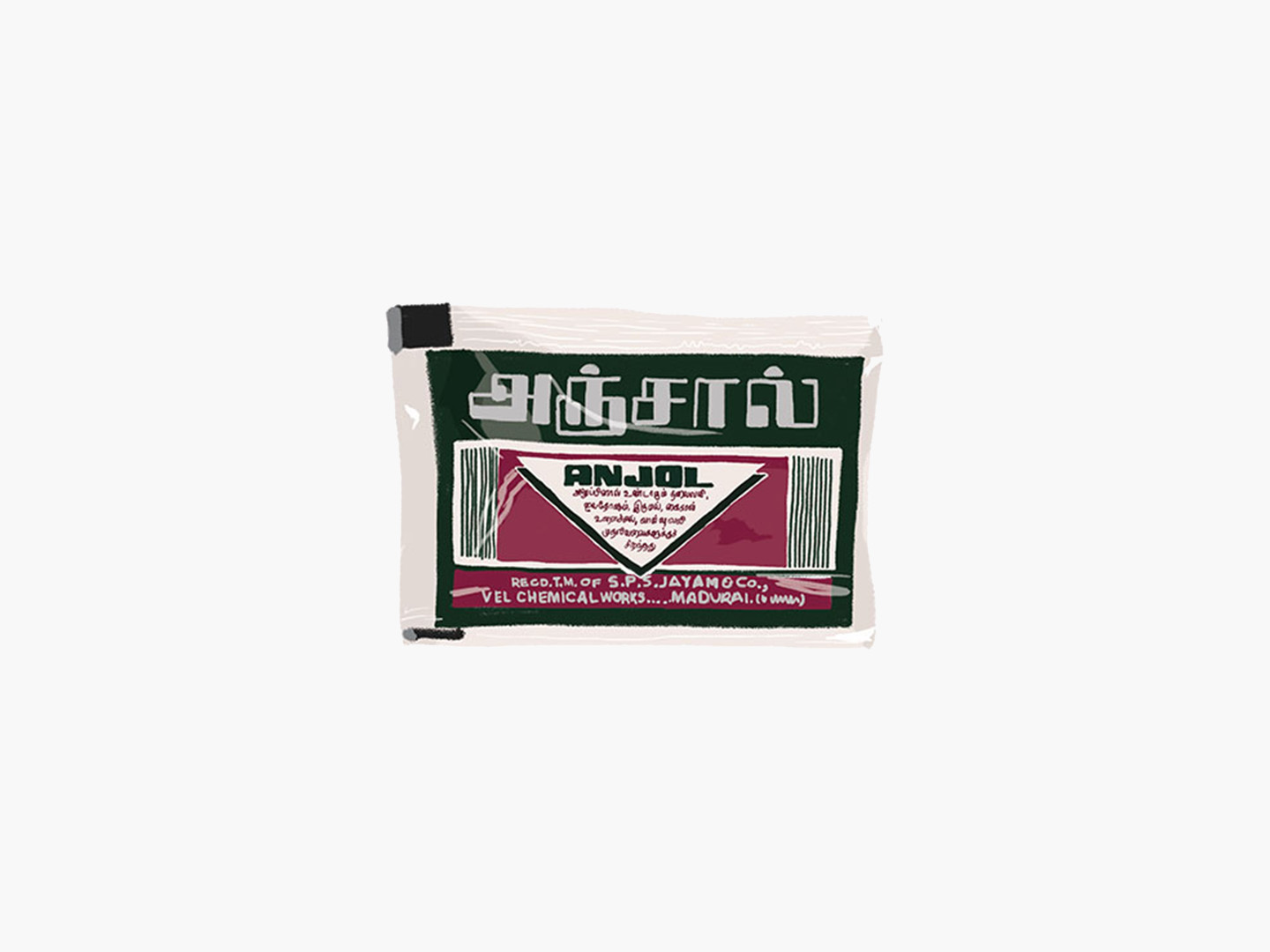
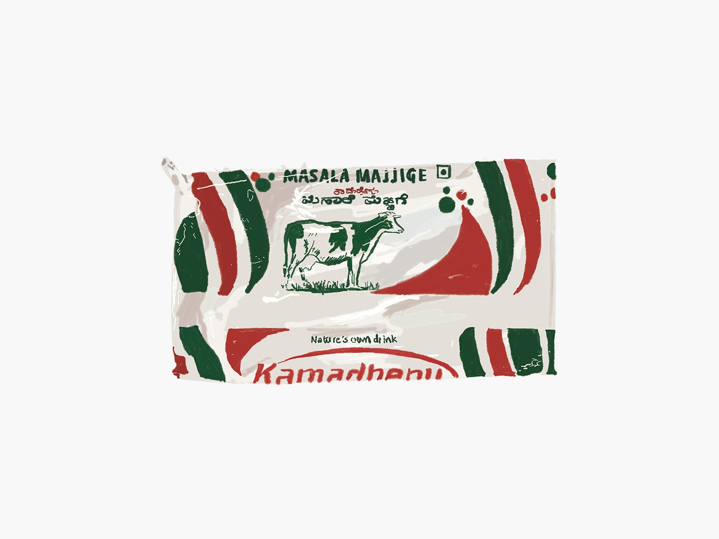
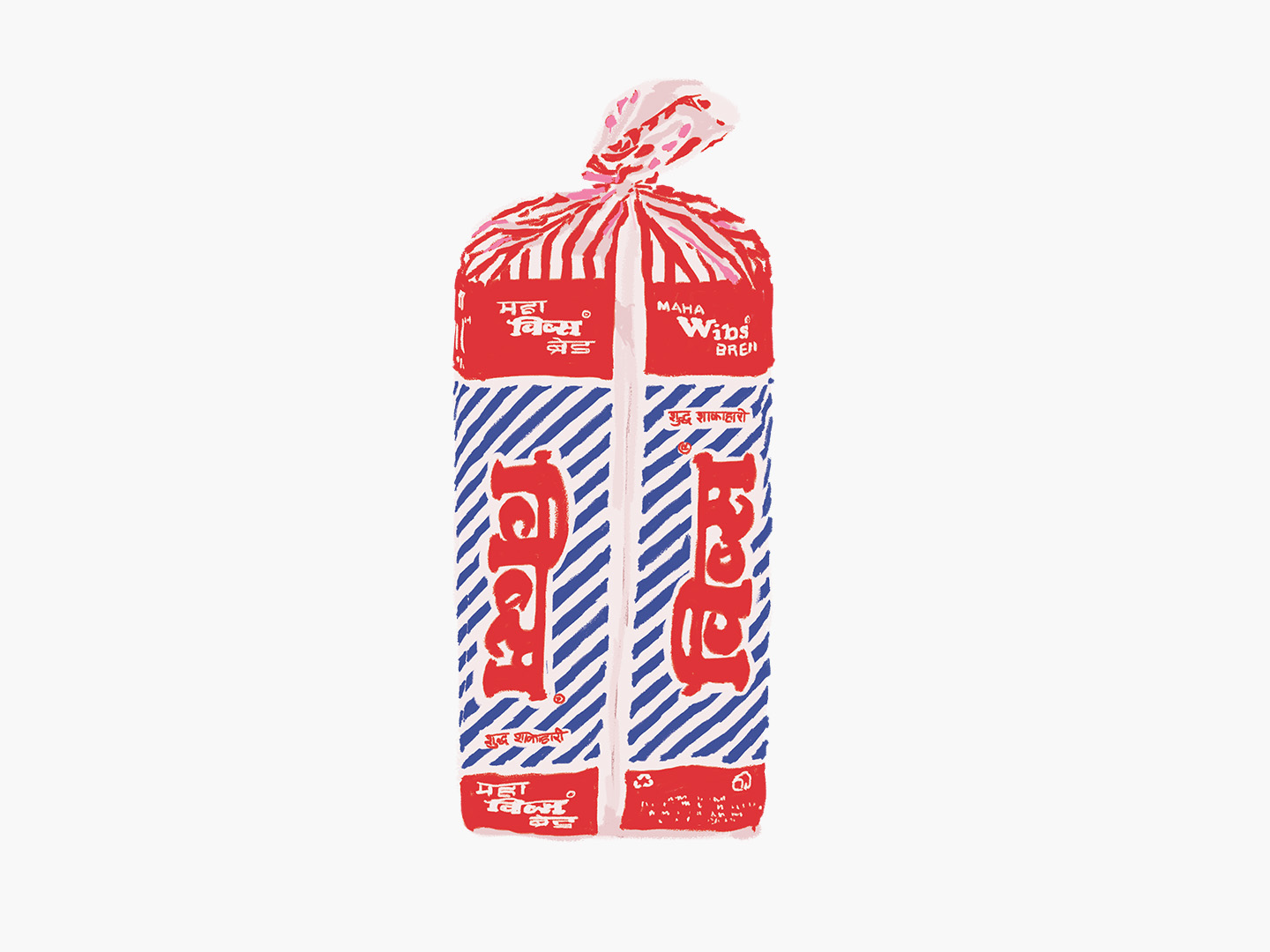
Digital illustrations of a selection of over 300 articles collected from various parts of the country, that covers varied examples of graphic design in India, such as product packaging, posters, hoardings book, magazine and album covers, etc. The selection takes into account informal designers, who typically work at print and photocopy shops, (popularly known as DTP artists) as well as formally trained designers.
Medium: Digital paintings





Series 4:
Oh Flip!
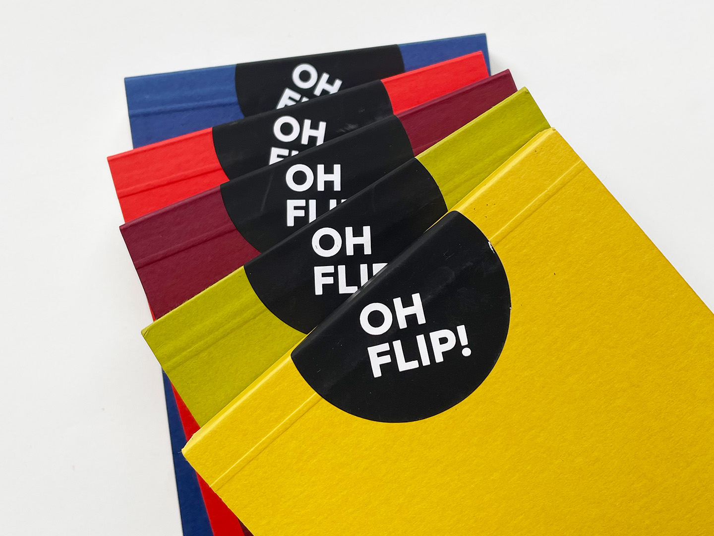
A series of 5 flipbooks documenting, in motion, ubiquitous iconography found in our day to day urban lives. For example, the many versions of the omnipresent (skull) danger sign are similar in the meaning they convey but each icon is ever so slightly different from the last - in hand painted style, vector cliparts, vinyl stickers, and other glorious avatars.
Medium: Digital + Screenprint on paper.
Dimensions : 8.5 cm x 15 cm





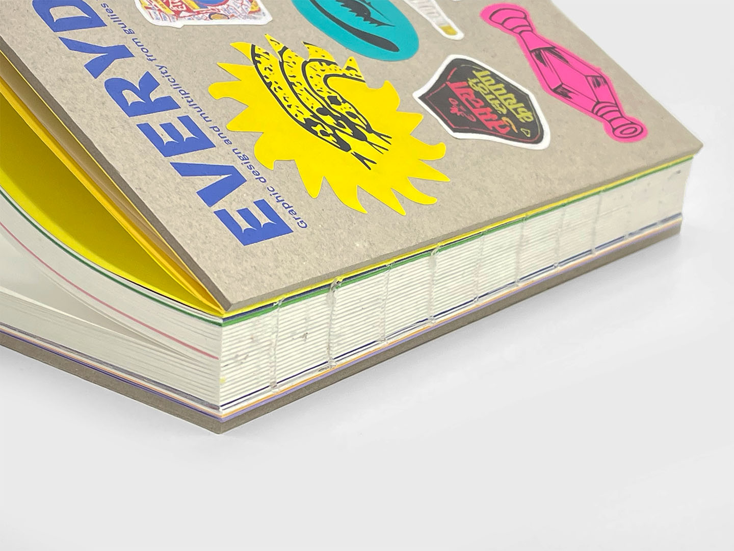
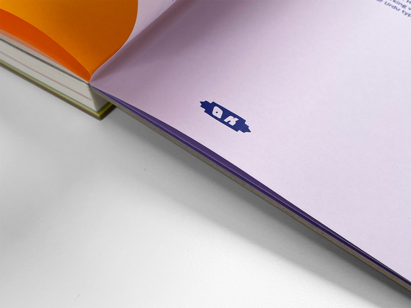
Much like the show’s exploration of India’s rich graphic art and design diversity, Everyday India Book draws from these themes in its materials, iconography, customisation, and colour palette. The cover is made of ‘kappa board,’ the same material found inside hardbound books, but in the book, it takes centre stage. It’s influenced by the urban decay we see around us.
The book is section-bound, allowing it to lay flat for optimal viewing. It comes with two sticker sheets—one screen-printed and the other offset-printed—inviting you to personalise the cover. This customisation echoes the Indian tradition of personalising everything, from bikes and taxis to workspaces and phone cases.

Our research spanned India, documenting various specimens under specific criteria. Products, storefronts, iconography - these had to originate from Indian brands and spaces.
The materials should, to some extent, reflect the nation’s inclusivity. Adhering to this, we also adopted the show title ‘Trench’ font by Shiva Nallaperumal licensed from Indian Type Foundry.

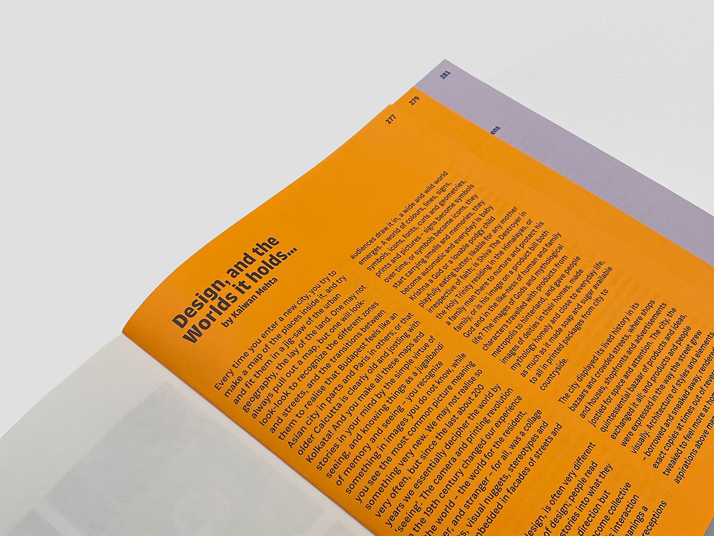
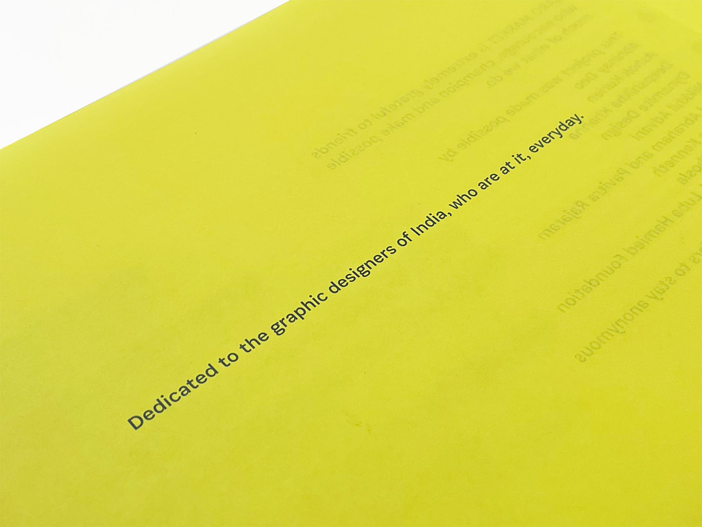
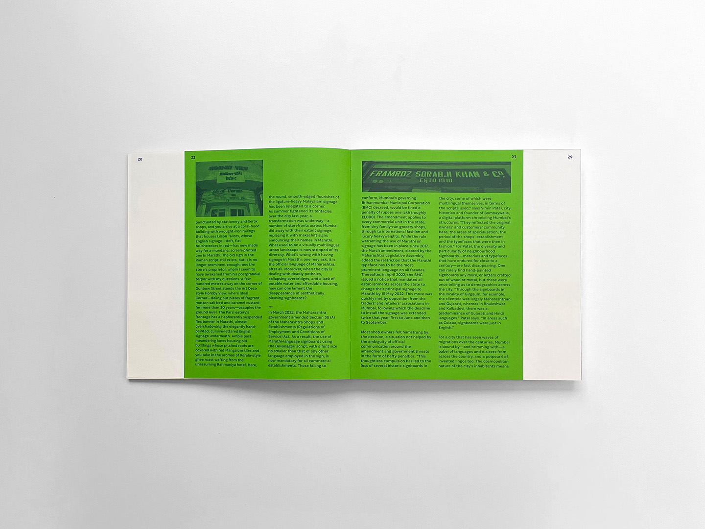
Contributions from Khorshed Deboo, Anusha Narayanan and Kay Khoo, and Kaiwan Mehta enhance the book with their perspectives on different facets of Indian graphic design. The foreword by Srila Chattterjee and our humble introduction add depth to the book.
These textual elements, separate from the illustrations, are thoughtfully presented in varied sizes and colours, inspired by single-colour handouts on vibrant papers, preserving their uniqueness.
The book acts as a documentation of the show, extending its life and broadening its reach.


Team Bombay Duck Designs:
Zeenat Kulavoor, Sameer Kulavoor, Swapnil Sawant, Humera Khan, Dnyanesh Patale, Mayur Chopade and Vedaant Mashruwala.
2023